Egali is the culminating project for my Masters of Fine Arts, completed in May 2017 at the University of Minnesota, College of Design.
Background Image: Jesse Allen & Robert Simmon 2014
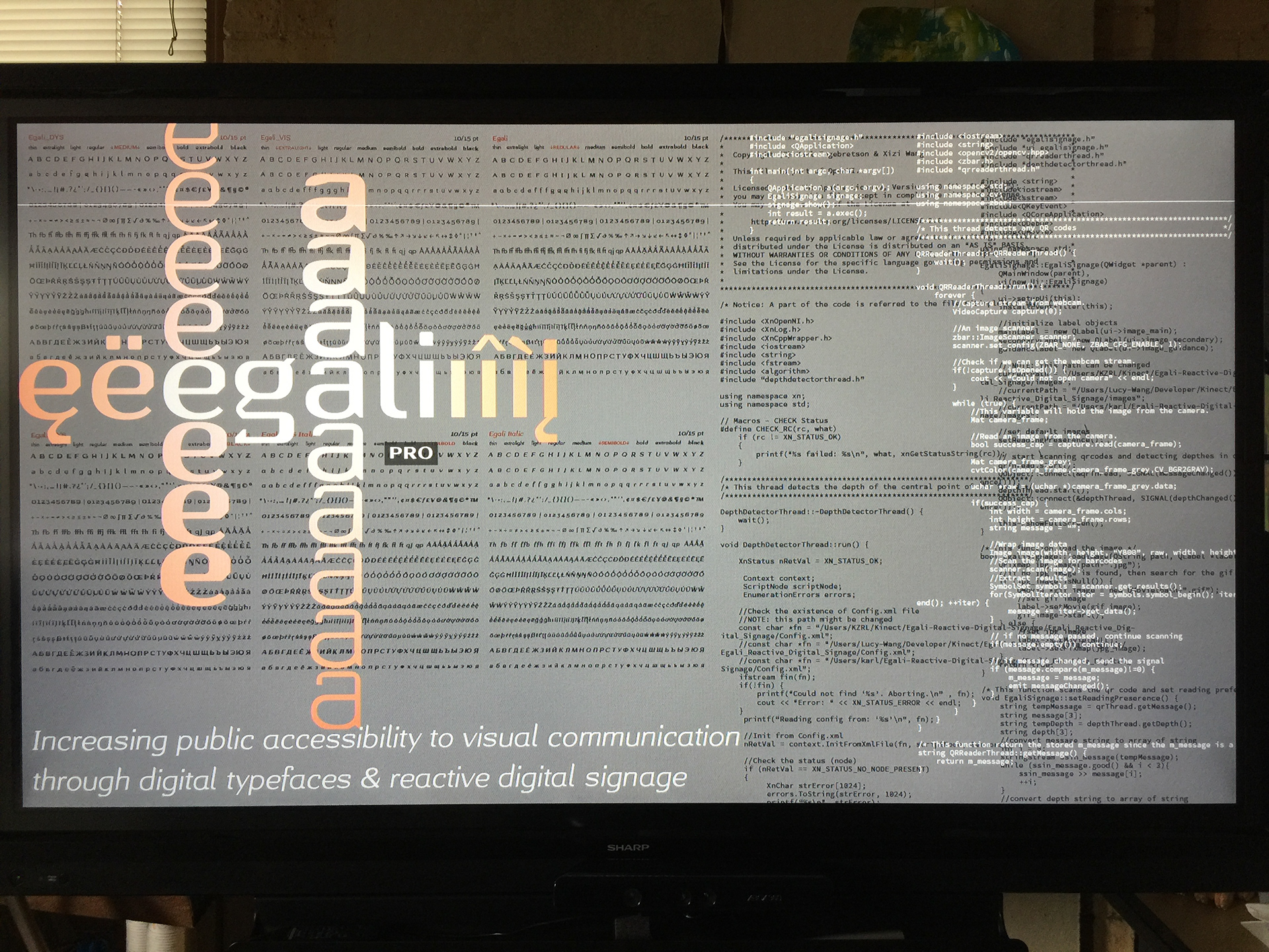
This project focuses on the development of two independent components to achieve its goal: a typeface that has multiple variations that address specific accessibility needs through letterform design and a digital signage prototype that reacts to a user’s presence and can easily change the language and format of text on display.
Background Images: Left—Procsilas Moscas, 2005; Right—Jesse Allen, 2014
This concept of leading the eye (illustrated above) was aided in part by Professor Philipp Stamm of the Basel School of Design during a type design course in June 2016. Professor Stamm’s feedback provided a way to tame the flow of the eye. The original 90° corners were replaced with subtle curved strokes in the top-right corner of the counters; and different curve/angle for each weight of the typeface (thin–black, e.g.).
Background Images: Left–Roman Boed, 2014; TR–Sergey Norin, 2015; BR–Jörg Schubert, 2013;
The ultimate goal of Egali to universal language support. For the prototype of this accommodating concept an accompanying script that would present a noticeable shift in language was needed—Cyrillic.
Background Photo: Roman Boed, 2014
Typeface designers often utilize interpolation, a mathematically based vector drawing transformation tool that has been used for decades. By modifying the single core font of Egali into two versions of different weights, thin and black (very bold), I gained easy access to iterative steps anywhere between the two extremes. Nine weights of Egali were refined, 2 masters (the extremes) for thin and black as well as the 7 interpolated instances between them.
Where Egali separates itself from the development of other typefaces is that it has commandeered this interpolation function for the unintended use of extending the typeface to support readers with different visual requirements. Typefaces built to suit specific visual requirements are typically developed independently of a coordinated typeface resulting in a single, but obviously separate solution. Egali’s aim is to not separate users with different visual requirements from the designscape, but rather cater to their needs under the same typographic and aesthetic umbrella.
Background Images: Left–Rodrigo Paredes, 2016; Right–7052657985_e583c73962_o.jpg Flickr 2012
Background Image: Andrés Nieto Porras, 2012
Even with the goal of an inclusive design achieved, the effectiveness of the typeface remains to be seen. The typeface variations are based on existing research only and have yet to be tested on the populations they are intended to serve. It was not the goal of this project to design, test, and deliver these fonts ready for immediate use, but rather create the components of an inclusive design experience. If you are interested in testing this typeface for academic purposes please contact me via hello [at] kzrl [dot] net.
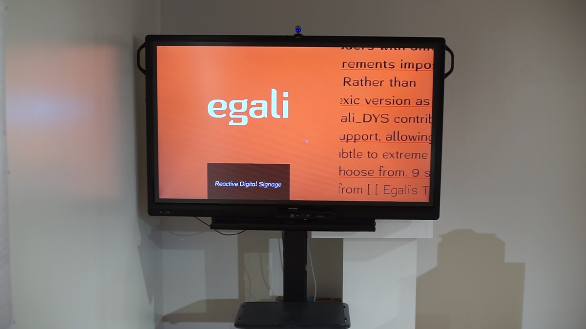
The goal of the Egali Reactive Digital Signage is to provide an inclusive signage experience removing any prominence to a particular language or user type. The content appears with the same design consideration for all, equating to a perception of equal value.
Xizi (Lucy) Wang, a freelance coder and programmer, contributed significantly to the digital signage component of this this thesis project. and greatly surpassed the quality and functionality I could have achieved on my own. Thank you Lucy. This code components of Egali are on GitHub here:
The software components were compiled and/or modified by Lucy to allow for multiple simultaneous operations to appear on screen. The application development program QT was used to coordinate various C++ processes and export the visual final product. QT also dictated the three containers for the visual content.
Egali Digital Reactive Signage easily allows for user with different language needs or different reading requirements to access the content in their preferred format. For this prototype English and Russian language versions of the content were developed, as well as versions that display the text in Egali_DYS or Egali_VIS.
Note: Russian text was used to illustrate how multi-lingual support could function and provide a obvious shift in language. Translations were created without language fluency but utilized Google Translate. As a result the language may or may not use proper grammar.
A high-definition WebCam was used to register the QR codes and change user type. The resolution of the camera, lighting and size of the QR placards was effective up to about 12 feet away from the camera and screen. While the QR codes functioned well, they were a technological stand-in for a much more efficient technology like Near-Field Channel or RFID.
The Xbox Kinect camera provided a constant stream of depth data by monitoring three tangents for object presence and then averaging their readings. The depth reading number would fall within a specified range that triggered the display of a specific graphic from within a specific user’s group of images.
Using depth as the control for revealing additional content resulted in a intuitive interactive trigger. Scale of typography was based off of well-known suggestions for type and distance guidelines. The depth data was tied to a range where a certain graphic was displayed. The closer the user got to the screen more and different sizes of text content appeared.
Three divisions of the display could each independently access a different graphic file for different depth ranges. Allowing for graphic transitions at a variety of disconnected depths. The ability to display different graphics at different depths was an attempt to simulate the visual experience of a web page designed with parallax functionality. For the final example of Egali signage, all three containers shifted their graphics simultaneously.
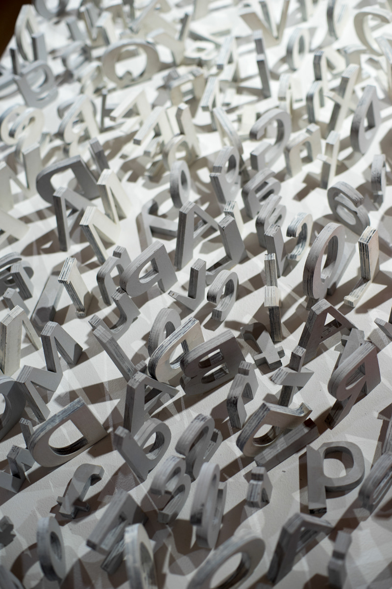
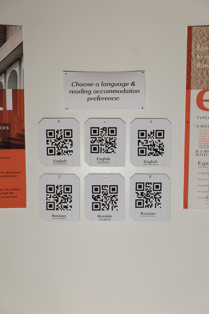
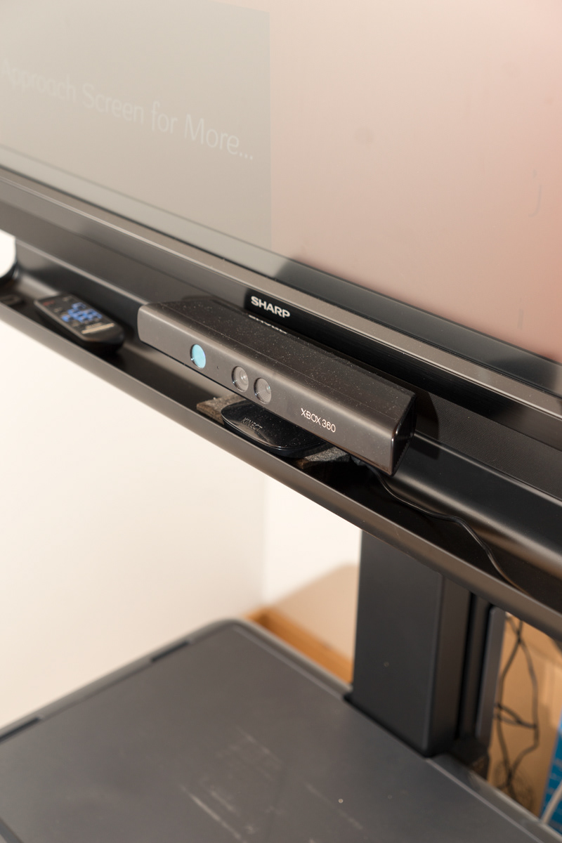
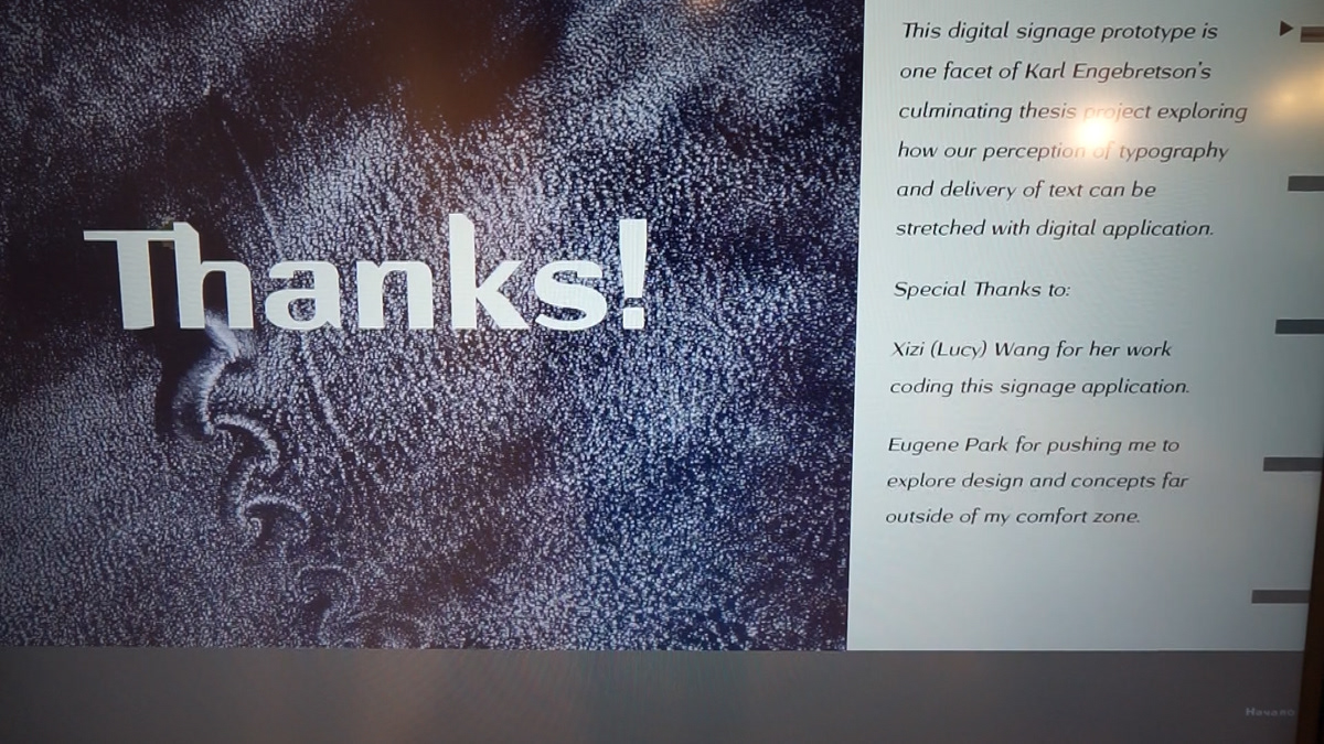
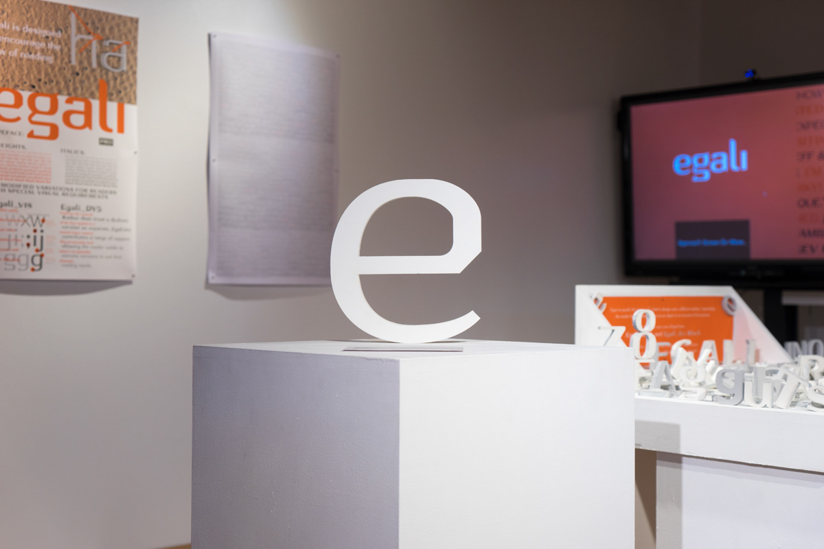
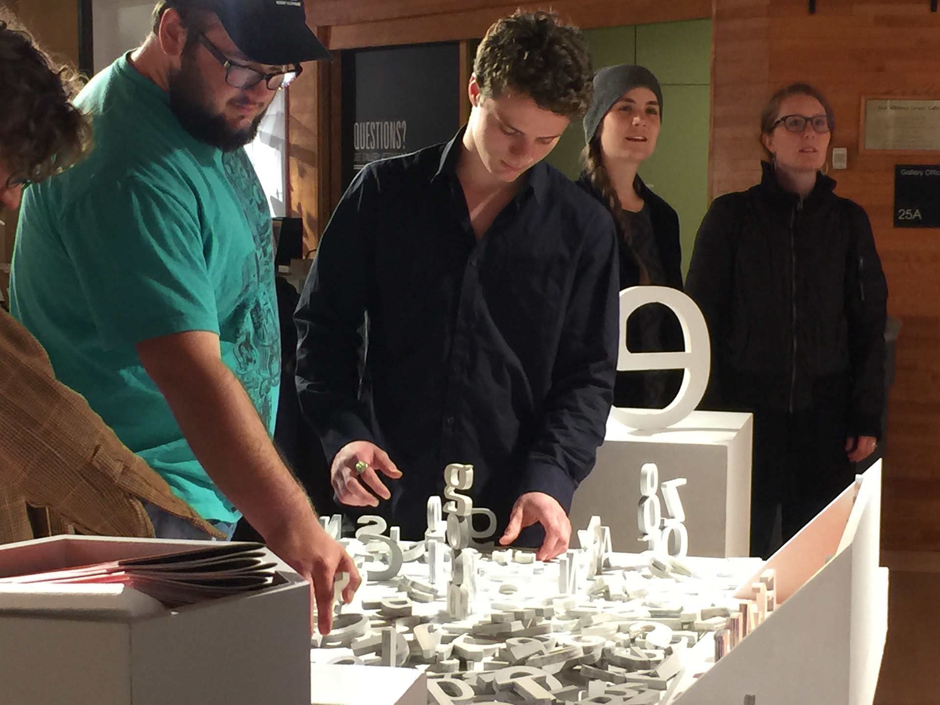
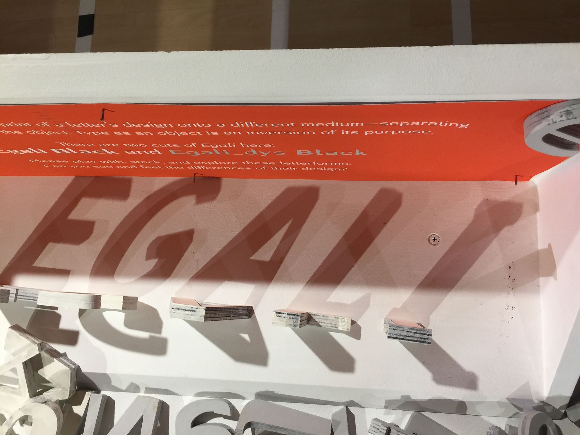
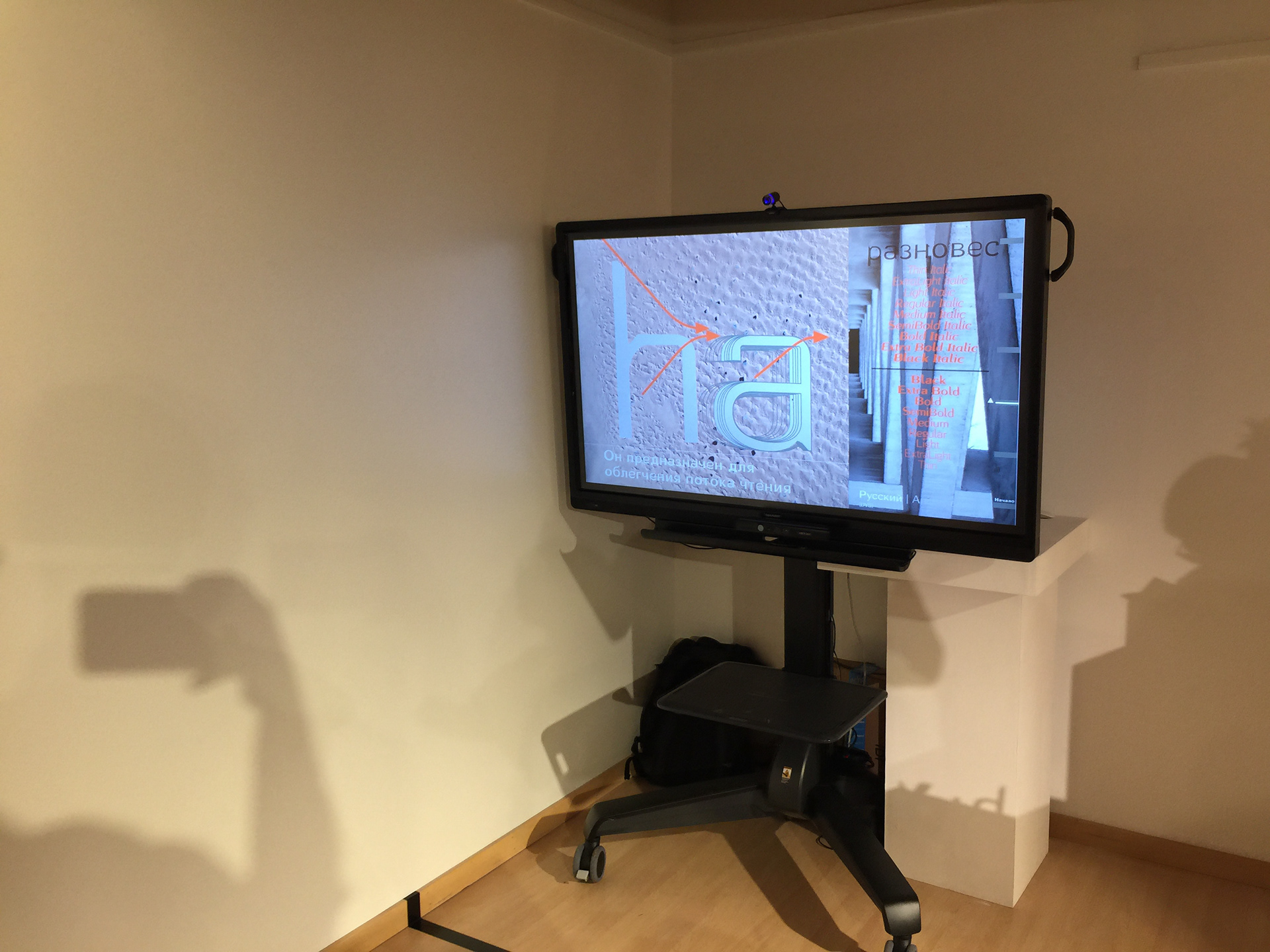
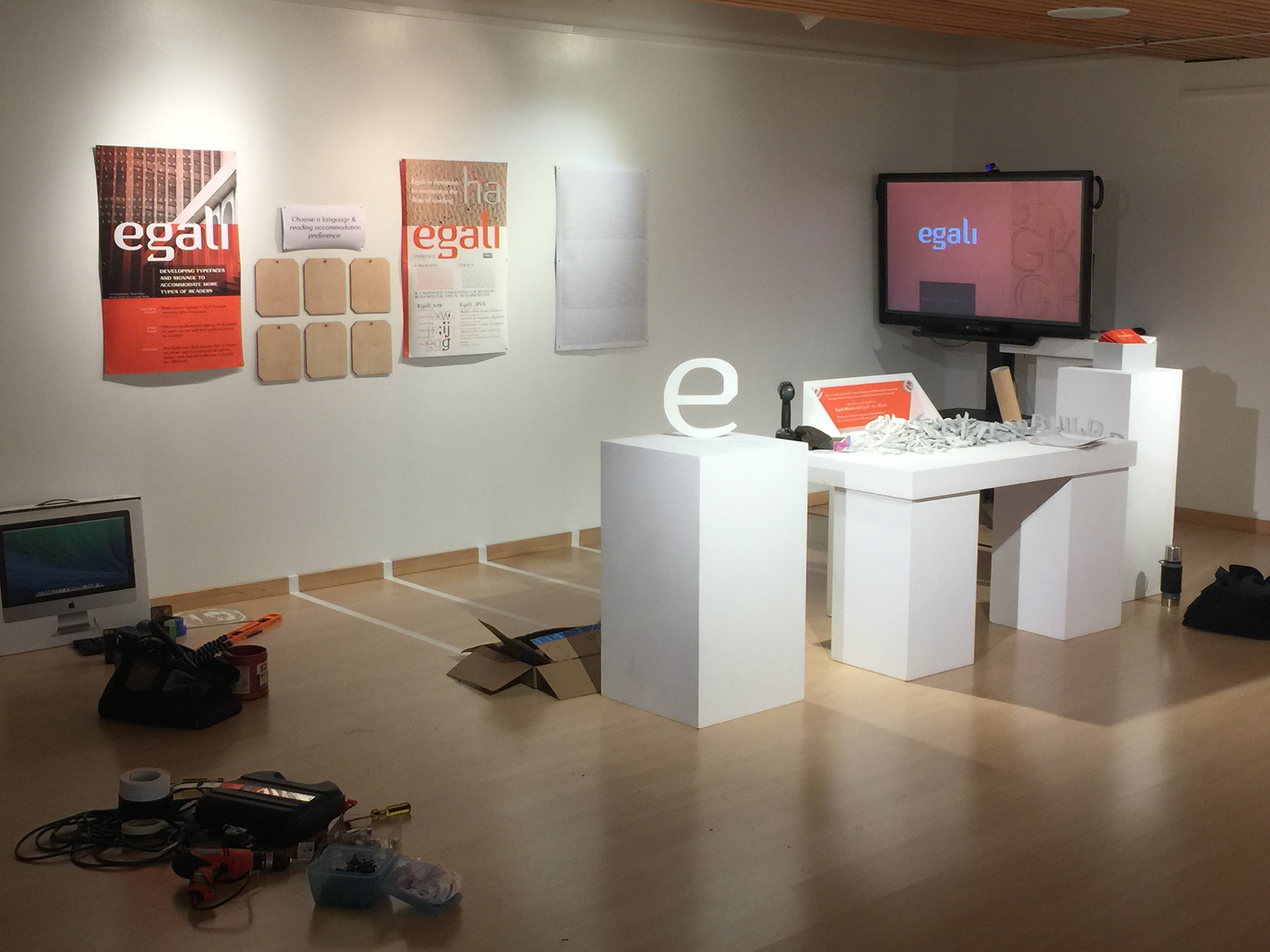
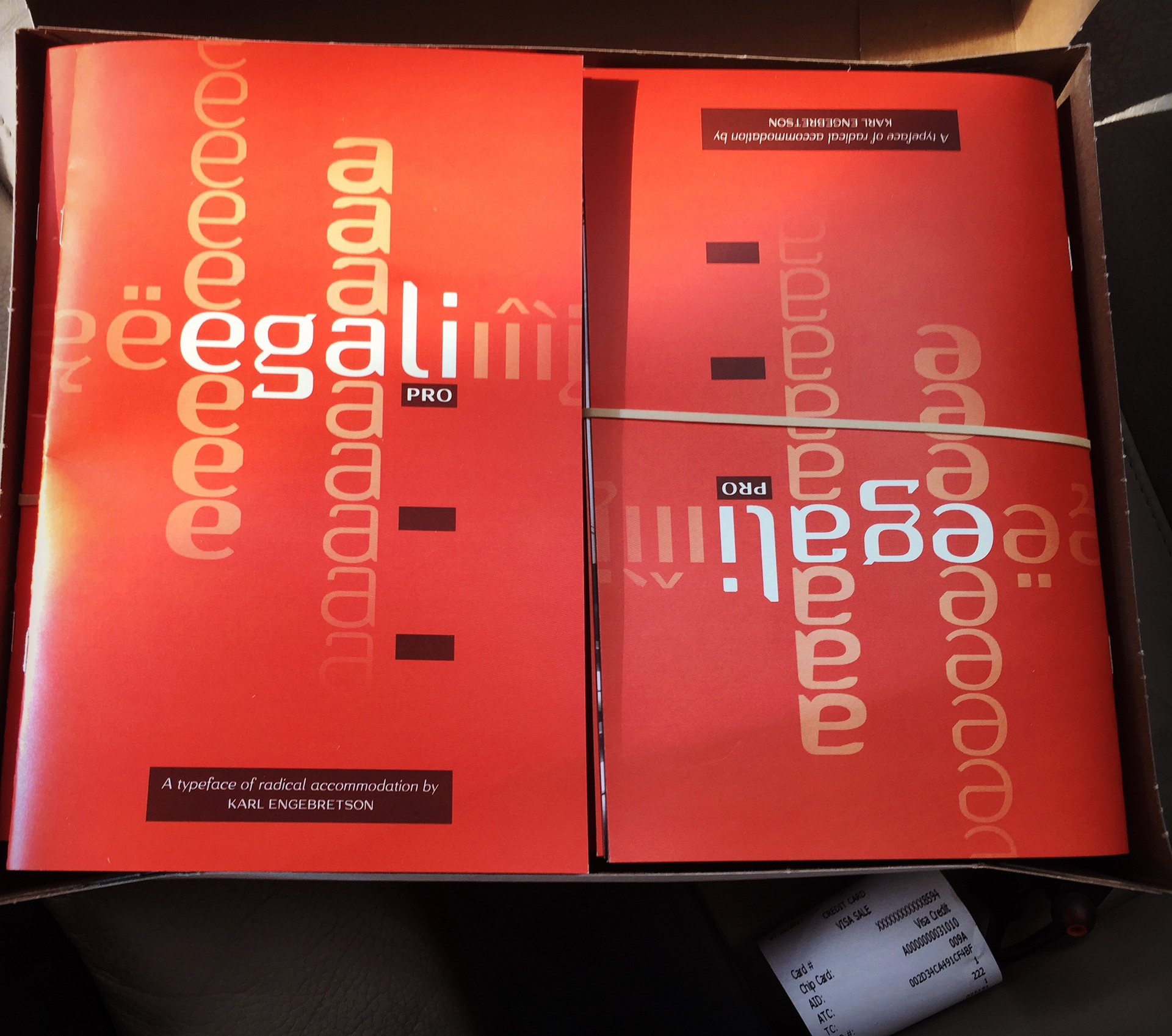
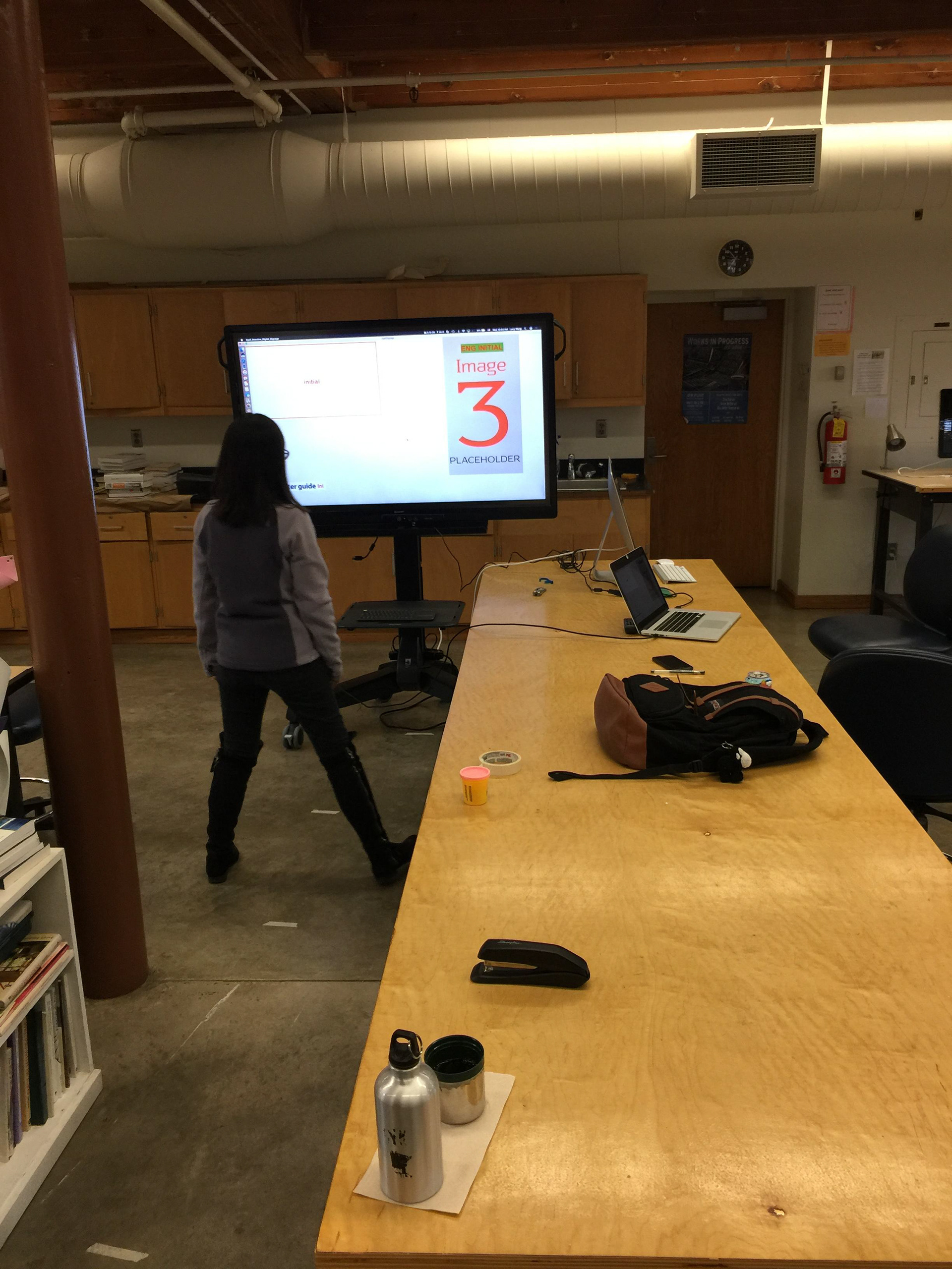
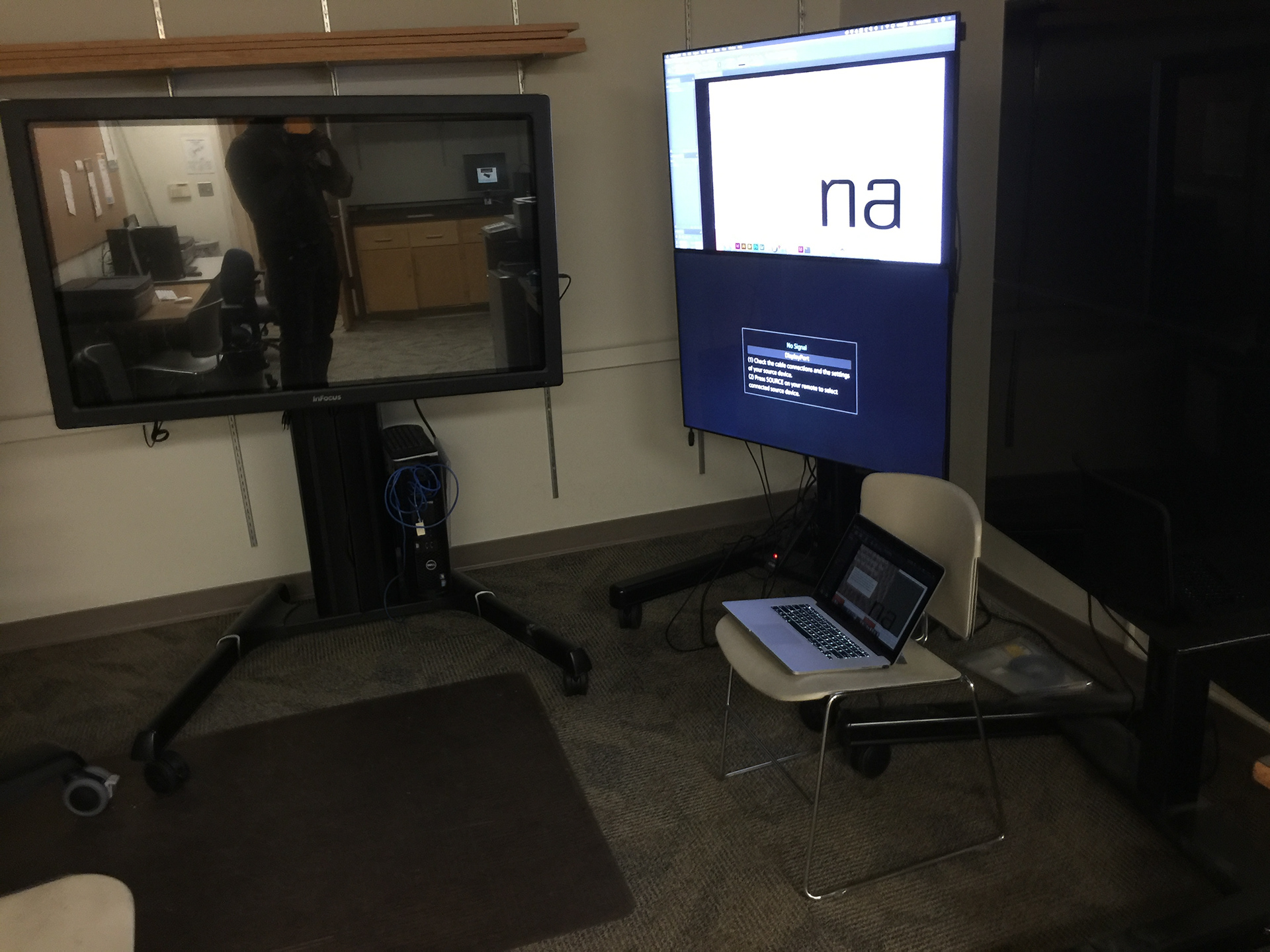
The coordination of the typeface and the digital reactive signage into a welcoming and inclusive design experience seemed to resonate with attendees at the exhibition. They were able to easily change user types and access the content within the Egali signage. The typeface displayed the content of the exhibit in various engaging formats—including shifts in language and accessibility versions without exiting the overall design experience. The process of switching user types and triggering the content was efficient and provided an easy flow to one user at a time.
Extra Special Thanks to:
Prof. Eugene Park,
my graduate advisor. He pushed me to explore designs and concepts far outside my comfort zone.
Prof. Steven McCarthy &
Dr. Lana (Svetlana) Yarosh (http://lanayarosh.com/),
my thesis committee members who helped tame tangential aspects and steer Egali into a successful and engaging project.
Dr. Lana (Svetlana) Yarosh (http://lanayarosh.com/),
my thesis committee members who helped tame tangential aspects and steer Egali into a successful and engaging project.
Xizi (Lucy) Wang (http://xiziwang.me/), your help made Egali work instead of be a mocked-up thought.
Abbey & Ox3, my patient family. At the core of everything I do, I do it for them.
Mom & Dad, for everything. Especially unquestioning support when you allow us to pursue our passions.
This project is ongoing. Contact me if you are interested in testing or collaborating on this progressive typographic approach to accommodation. hello [at] kzrl [dot] net.
